
Date Picker #
From version 1.2.197 the storefront calendar is chosen with a single setting, at Rentals > Settings > Calendar Styler > Date Picker. There are four options:
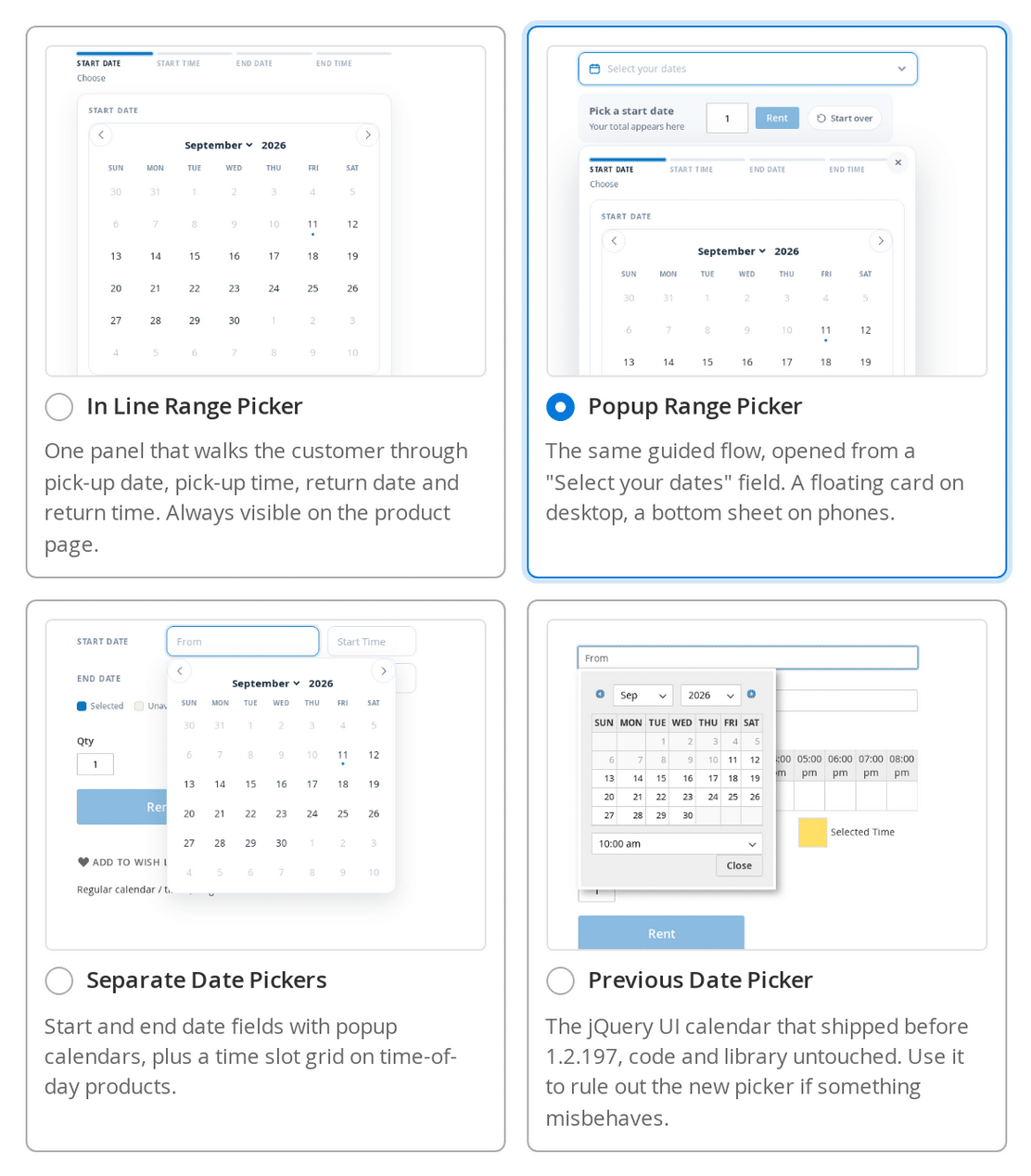
- In Line Range Picker (the default) – one panel that walks the customer through pick-up date, pick-up time, return date and return time. Always visible on the product page.
- Popup Range Picker – the same guided flow, opened from a “Select your dates” field. A floating card on desktop, a bottom sheet on phones.
- Separate Date Pickers – start and end date fields with popup calendars, plus a time slot grid on time-of-day products. This is the arrangement described under “Regular – Start and End Date” below.
- Previous Date Picker – the jQuery UI calendar that shipped before 1.2.197, code and library untouched. Use it to rule out the new picker if something misbehaves.
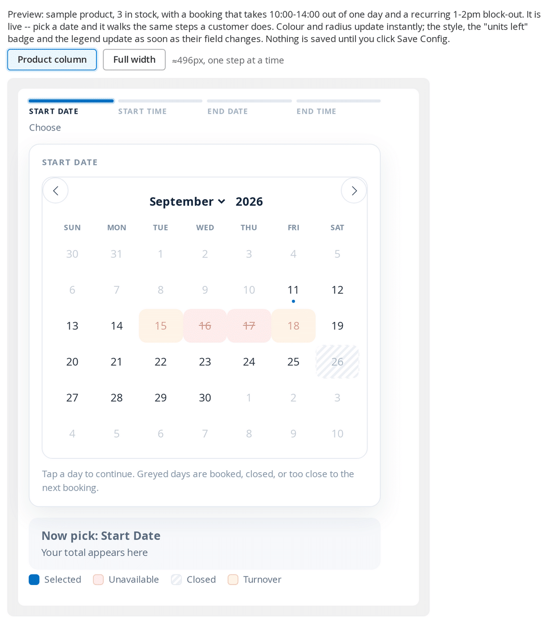
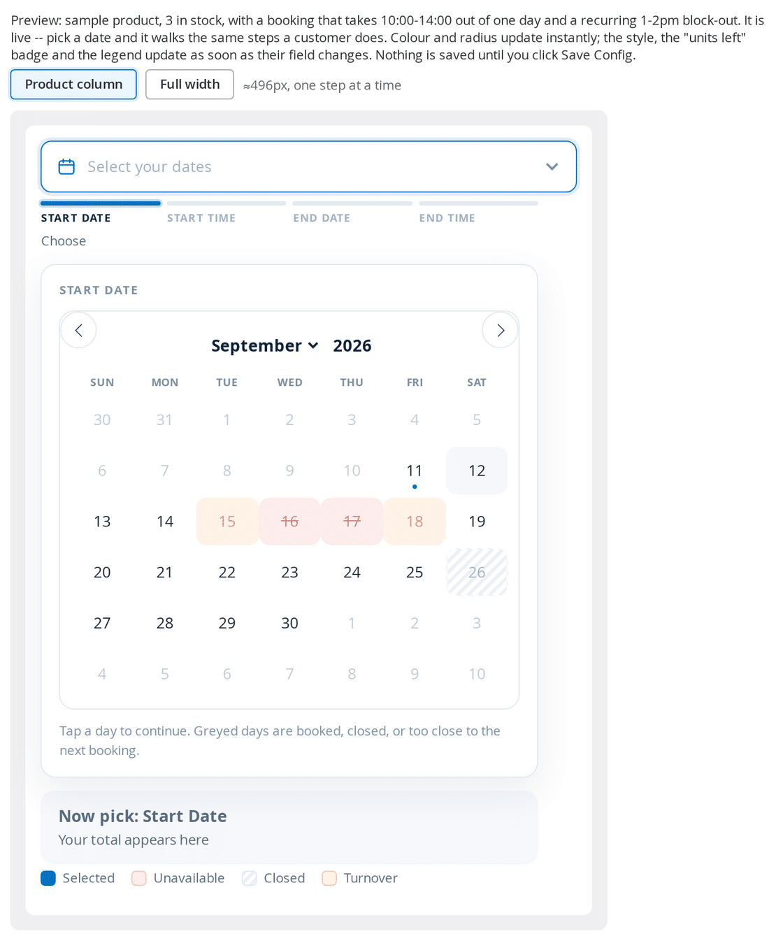
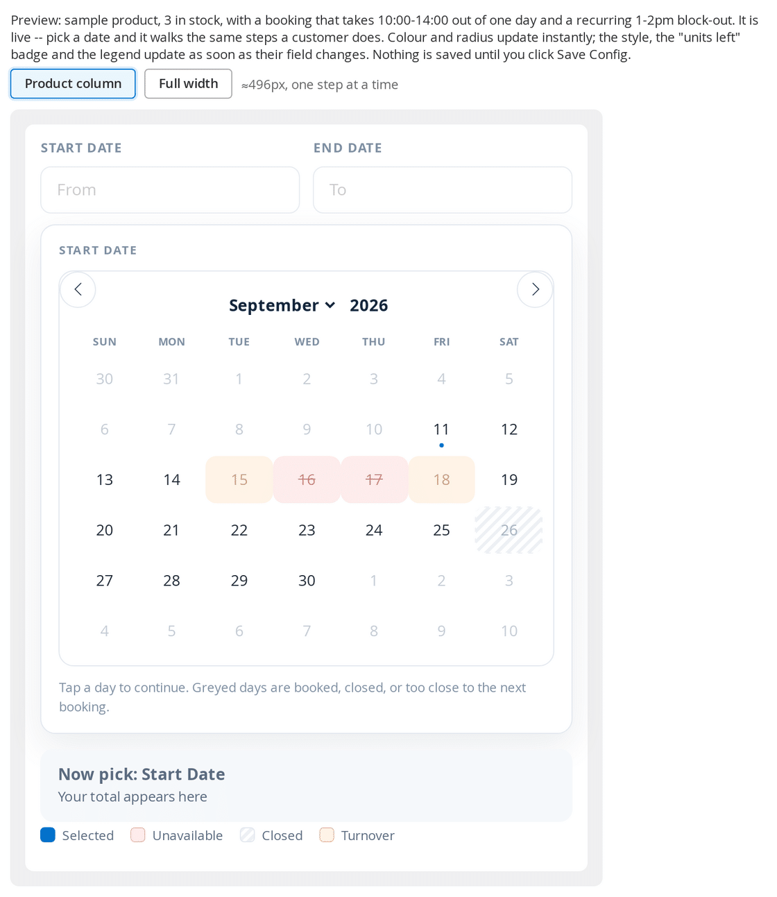
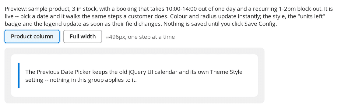
The Calendar Styler shows a screenshot card for each of the four, so you can see what you are choosing, and a live interactive preview beside the settings that walks the real flow – pick-up date, then pick-up time, then return date, then return time – as you change the style, colour, corner radius and number of months.
Each answered step reveals the next, and a progress row above the panel shows what has been chosen so far and lets the customer click back to change a step. Changing the pick-up date clears the return date and the times that depended on it, so a part-answered booking can never be submitted.
What happened to Calendar Engine and Always Show Calendar #
Date Picker replaces both of those settings. Existing stores are migrated rather than reset, so the calendar your customers see does not change when you upgrade:
- Calendar Engine set to Legacy becomes Previous Date Picker
- Always Show Calendar set to Yes becomes In Line Range Picker
- Always Show Calendar saved as No becomes Separate Date Pickers
- A store that had never saved either setting picks up the new default, In Line Range Picker
A store view that already has a Date Picker value is never overwritten, and the old settings are removed afterwards so they cannot be saved to something nothing reads.
The per product attribute “Show the calendar in line” is unchanged and still overrides the store setting: Use Config Settings follows the store, Yes gives that product a range picker, and No gives it the separate start and end fields. It has no effect on the Previous Date Picker, which is a separate code path and reads the attribute itself.
One limitation worth knowing: the Previous Date Picker is not available on a Hyvä storefront, because it needs the jQuery UI widget and therefore RequireJS, which Hyvä does not ship. A Hyvä store always gets the new calendar whatever this setting says.
Regular – Start and End Date #
This is the Separate Date Pickers option, and it was the default before version 1.2.197. The customer selects the start and end dates by clicking in the input boxes, which then popup the calendars:
On a new 1.2.197 install the default is the In Line Range Picker instead, which asks for the same four things one step at a time in a single panel. To keep this arrangement, set Rentals > Settings > Calendar Styler > Date Picker to Separate Date Pickers. The screenshot above shows the Previous Date Picker.
Fixed Rental Lengths #
This can be configured globally in
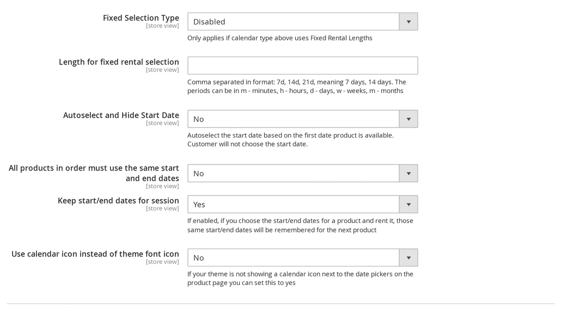
rentals > settings > calendar options > length for fixed rental selection
rentals > settings > calendar options > Fixed selection type
Here is an example setup:
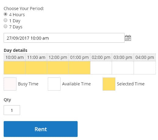
and what it would look like on the product page:
You can also set fixed rental lengths by product (rather than globally) to do this go to edit your product and then the rental heading, and adjust these settings (make sure to uncheck “use config settings”)


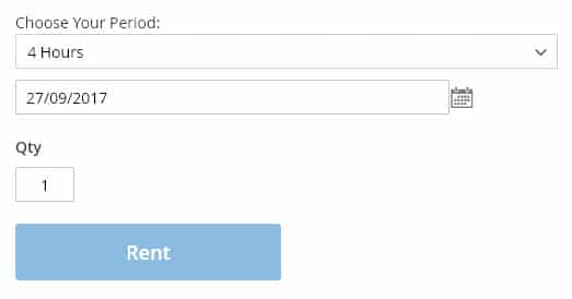
You will notice this time we chose “drop down” for fixed selection type the product page will look like this:
Fixed Rental Lengths With No Calendar #
It is possible to just have a rent button for products with no calendars. The first available date will be auto-selected for the rental, and the rental length will be the fixed rental length that you put. Follow the same instructions as above for fixed rental lengths.
- Rentals > Settings > Calendar > Autoselect and Hide Start Date should be Yes
- Rentals > Settings > Calendar > Fixed Selection Type should be drop down
- Rentals > Settings > Calendar > Length for fixed rental selection should only have one fixed length like 4d if you want the auto-selected fixed length to be 4 days. Since the fixed length selector will be hidden don’t select multiple fixed lengths.
You can also do the same things as above on a product by product basis by editing the product and configuring the same options under the “Rental” heading.
On the In Line and Popup Range Pickers a fixed length product is only asked for the start date, and the pick-up time where times are enabled – the length decides the return, so there is nothing else to ask. The chosen rental length is shown above the radios or the drop down.
Enabling Time of Day #
This is done from the edit product page and the field will appear usually above the SKU entry, it looks like this:

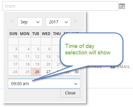
When this is enabled, the product will have a time of day selection in the calendar:
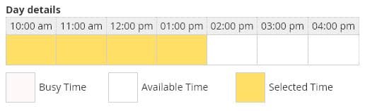
along with a grid below the calendar so the customer can see what time of day has been selected:
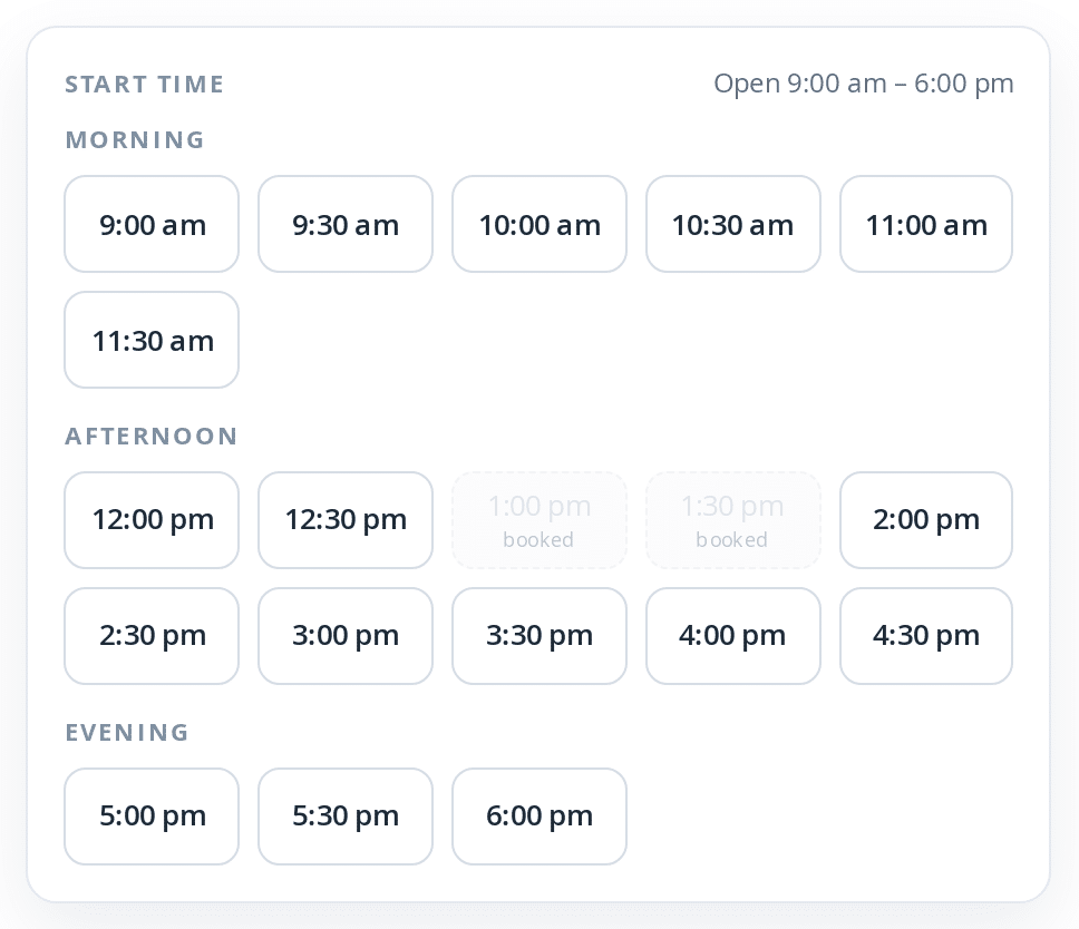
From version 1.2.197 the three new pickers show the time of day as a slot grid rather than a drop down: the chosen day’s times at the interval you set in Rentals > Settings > Calendar Styler > Time slot interval (minutes), grouped under Morning, Afternoon and Evening, with the store hours in the heading. A time that cannot be picked is greyed and now says why – Booked when someone else has reserved it, Disabled when an administrator has closed part of that day, “before pick-up” on a same day return, or “too short” when it would make the rental shorter than your minimum period. The screenshots above show the Previous Date Picker.
Calendar Options #
The following settings can be found under rentals > settings > calendar options: Theme Style, Hide (filter out) products not available for selected dates, Fixed Selection Type, Length for fixed rental selection, Autoselect and Hide Start Date, All products in order must use the same start and end dates, Keep start/end dates for session, and Use calendar icon instead of theme font icon.
From version 1.2.197 the settings that decide which calendar is used and what it looks like have their own group, at Rentals > Settings > Calendar Styler. See Date Picker at the top of this page, and Calendar Styler at the bottom.
Theme Style #
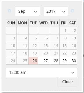
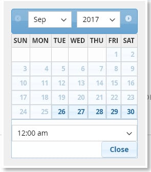
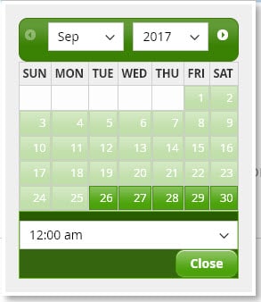
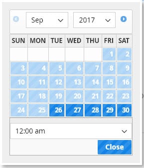
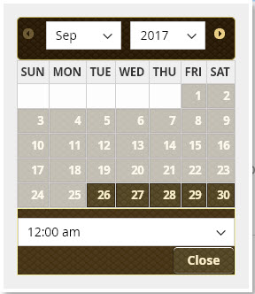
You can set the color/theme style of the calendar, these are the options available:
In version 1.2.197 and later Theme Style is only used by the Previous Date Picker. The other three pickers are styled from the Calendar Styler group – Style, Main colour and Corner radius – and ignore this setting.
 Default |
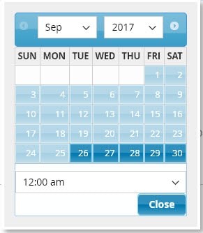 Start |
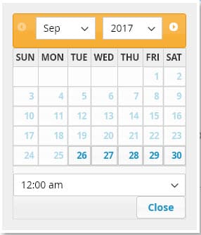 Lightness |
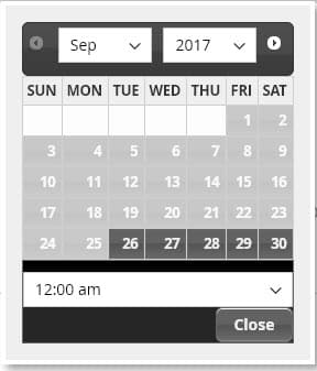 Darkness |
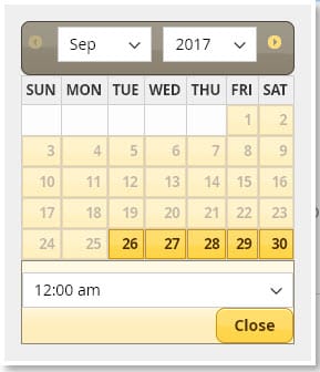 Sunny |
 Redmond |
 Le Frog |
 Excite Bike |
 Swanky Purse |
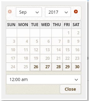 Pepper Grinder |
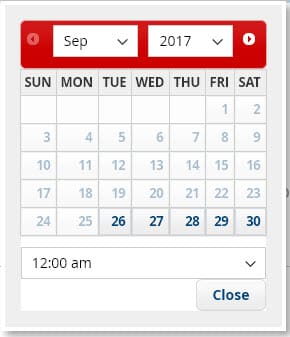 Blitzer |
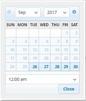 Cupertino |
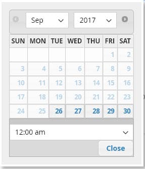 Overcast |
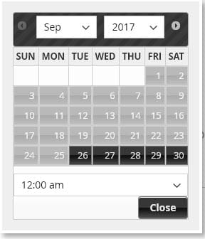 Black Tie |
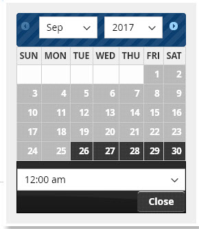 Dot Love |
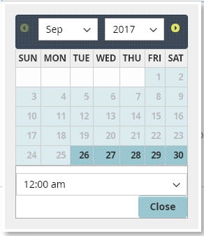 Hot Sneaks |
Number of months to show on date picker #
In version 1.2.197 and later this setting is called Months shown and lives in Rentals > Settings > Calendar Styler. It is a single number – 1, 2 or 3 – and rows are no longer supported.
Stores upgrading from an earlier version are converted automatically: an old [rows,columns] value becomes rows multiplied by columns, capped at 3. So [1,2] and [2,1] both become 2 months, and [2,2] becomes 3. Two months look like this on the product page:
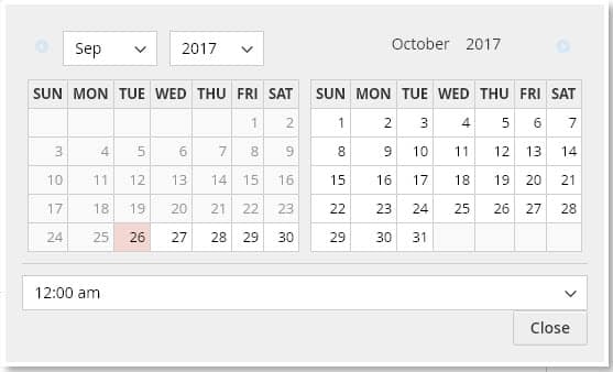
Two or three months need a wide product column. Where there is not enough room the calendar scrolls sideways rather than dropping a column, so nothing is clipped.
Always show calendar #
This setting was removed in version 1.2.197 and replaced by Date Picker in the Calendar Styler group – see Date Picker at the top of this page. A store that had it enabled is migrated to the In Line Range Picker, which shows the calendar on the product page without the customer clicking a field; a store that had it saved as off is migrated to the Separate Date Pickers.
All products in order must use the same start and end dates #
When enabled if a customer adds a product to the shopping cart for certain dates say September 1 – 5, then goes to rent another product but changes the dates to September 6 – 10, when they try to add the second product to the cart it will show an error message that all products in the order must use the same start and end dates.
Keep start/end dates for session #
When enabled and the customer chooses start/end dates for a product and adds it to the shopping cart, these same start and end dates will be pre-filled when they go to rent other products.
Calendar Styler #
New in version 1.2.197. Everything that decides which calendar the storefront uses and what it looks like is in one group, at Rentals > Settings > Calendar Styler, with a live preview of the real calendar beside the fields.
- Live preview – the real calendar markup and the real stylesheet, not a picture. Pick a date in it and it walks the same guided flow a customer walks, and Start over resets it. It can be shown at a typical product column width or at full width, because the calendar only puts the day grid and the time grid side by side when there is room for both.
- Date Picker – which of the four pickers the storefront uses. See Date Picker at the top of this page.
- Style – Airy, Card, Bold or Classic, each with a screenshot card.
- Months shown – 1, 2 or 3 months at once.
- Main colour – one hex colour, with a colour picker and six presets. Selected days, buttons, the today marker and the legend are all derived from it, including the lighter tints.
- Corner radius (px) – 0 to 24.
- Time slot interval (minutes) – the minutes between the buttons of the time slot grid on time-of-day products, from 5 to 240.
- Show the progress row – the Pick-up date, Pick-up time, Return date and Return time row above the guided panel. Range pickers only.
- Show units left in each day – for quantity based inventory, shows for example “2 left” under the day number.
- Show legend under the calendar – booked, closed, turnover and selected. Turnover entries only appear when “Show turnovers on calendar” is enabled.
Right to left locales are supported: in an RTL store the calendar renders right to left, including popup calendars.


